Increasing Revenue & Flexibility through a new e-commerce shop
Created a new way for customers to explore different treats, and make their subscription more flexible

Created a new online shopping experience for existing members, to give them more control over their subscriptions, one-time purchases and recurring deliveries.
About
Role
Product Designer within Monetisation Team
Deliverables
User Research, Prototyping, UX/UI

The project started with a few weeks of discovery and ideation workshops with stakeholders, product managers, and most importantly our users to get a better understanding of how they shop.
One key takeaway was that users wanted more flexibility over their subscriptions.
We had three user and business goals to achieve when launching the on-demand shop:
-
Based on some user interviews, clients often found themselves running low on treats before their next box was due.
-
On-demand purchases can serve as a gateway to upsell or cross-sell subscription plans or complementary products, boosting overall sales and customer lifetime value.
-
On-demand purchases can serve as a gateway to upsell or cross-sell subscription plans or complementary products, boosting overall sales and customer lifetime value.

✨ Outcomes from an ideation workshop with engineers and product managers

When designing the user journey and interface for Butternut Box, our primary focus lied on individuals who have dogs with picky eating habits or those with particular food allergies. Additionally, we had to take into account the following factors.
Things we took into consideration
-
Implementing robust filtering options that allow users to quickly narrow down products based on specific allergies or dietary restrictions.
-
Provide clear and detailed information about each product, including ingredients, nutritional values, and allergy warnings. Highlight allergen-free options prominently.
-
To display the available delivery options for each product, whether it's on-demand purchase or subscription-based delivery. Providing information about delivery times, costs, and any eligibility criteria.
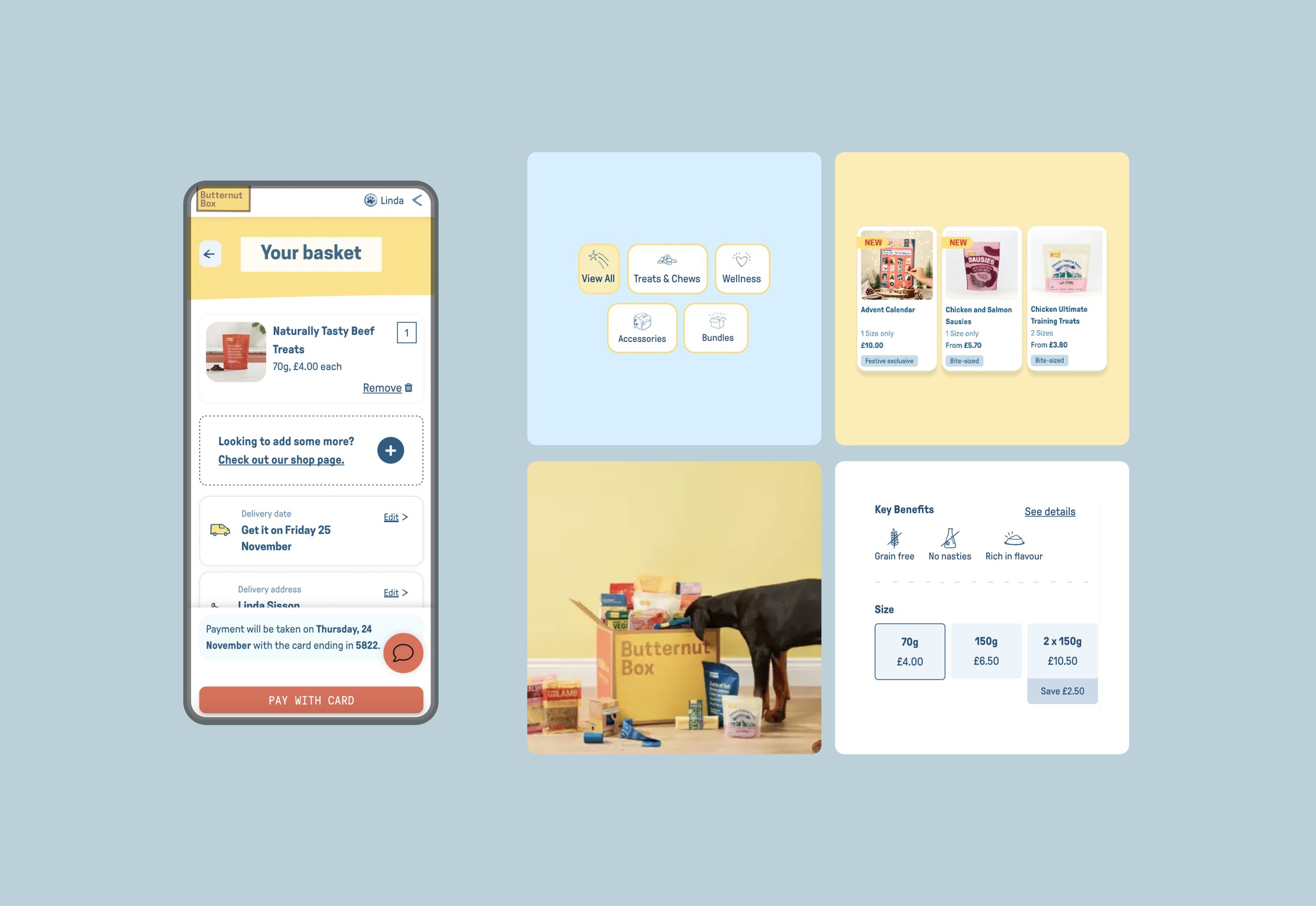
✨ Seemless Checkout Experience

The product was first launched in the UK and Northern Ireland markets, where we closely monitored its performance with analytics. We observed increased engagement post-launch, indicating strong customer interest. Subsequently, we expanded its availability to the Netherlands market.
What we achieved
-
Our user researchers monitored metrics such as site traffic, time spent on the site, and interaction with product pages or content. Both Active and Paused Subscribers were engaging with the shop which improved our customer retention rates
-
We streamlined the checkout process with a clear and simple interface. Minimised the number of steps required to complete a purchase and offered different delivery options for convenience.
-
We made sure our navigation menu was intuitive and easy to understand. Categorised products logically, such as by allergy type (e.g., grain-free, hypoallergenic), dog size, or specific dietary requirements.

Like with every project we were bound to experience a few bumps along the way. Here is what we found challenging and how we approached it.
What could have gone better?
-
Integrating the new shop with existing designs and legacy code was complex and required careful planning to ensure compatibility and data consistency. We had to make the difficult decision to incorporate the check-out basket in the header to meet the launch deadline, which was not ideal.
-
Knowing that eventually, we would launch into international markets it added complexity to the design process. We needed to ensure that our designs would accommodate lengthy translations while maintaining consistency across languages was essential for our usability.
-
Determining which filters to include and how to prioritise them required understanding the needs and preferences of the target audience. Prioritising filters based on relevance and frequency of use enhanced usability.