Expertise
UX Research
AA+ Accessibility Design
Pattern Library
Pattern Documentation
Novo Nordisk - Global Design System
Novo Nordisk medical products needed a platform to communicate medical information to their UK market. Our team worked towards creating a re-brandable design system to be used across multiple medical product sites. We had to create microsites for both diabetic people & healthcare professionals with accessibility in mind.
The Problem
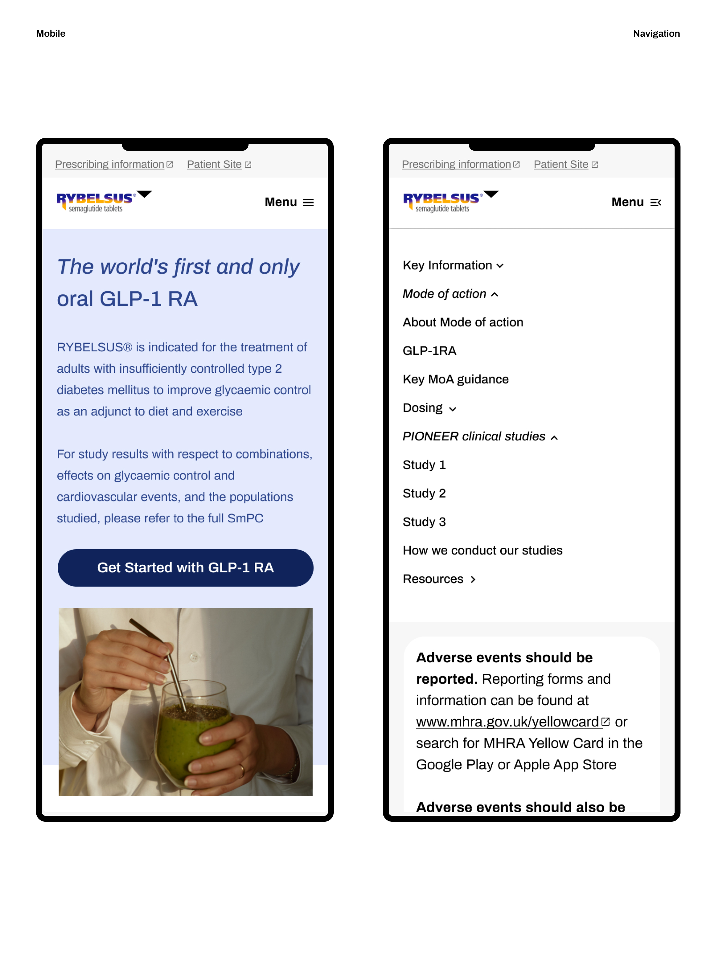
The challenge we faced from the get-go was that Novo Nordisk had no digital presence prior to Covid-19, meaning that we needed to launch five microsites quickly to help diabetic people and HCPs get the information they needed efficiently.
The Solution
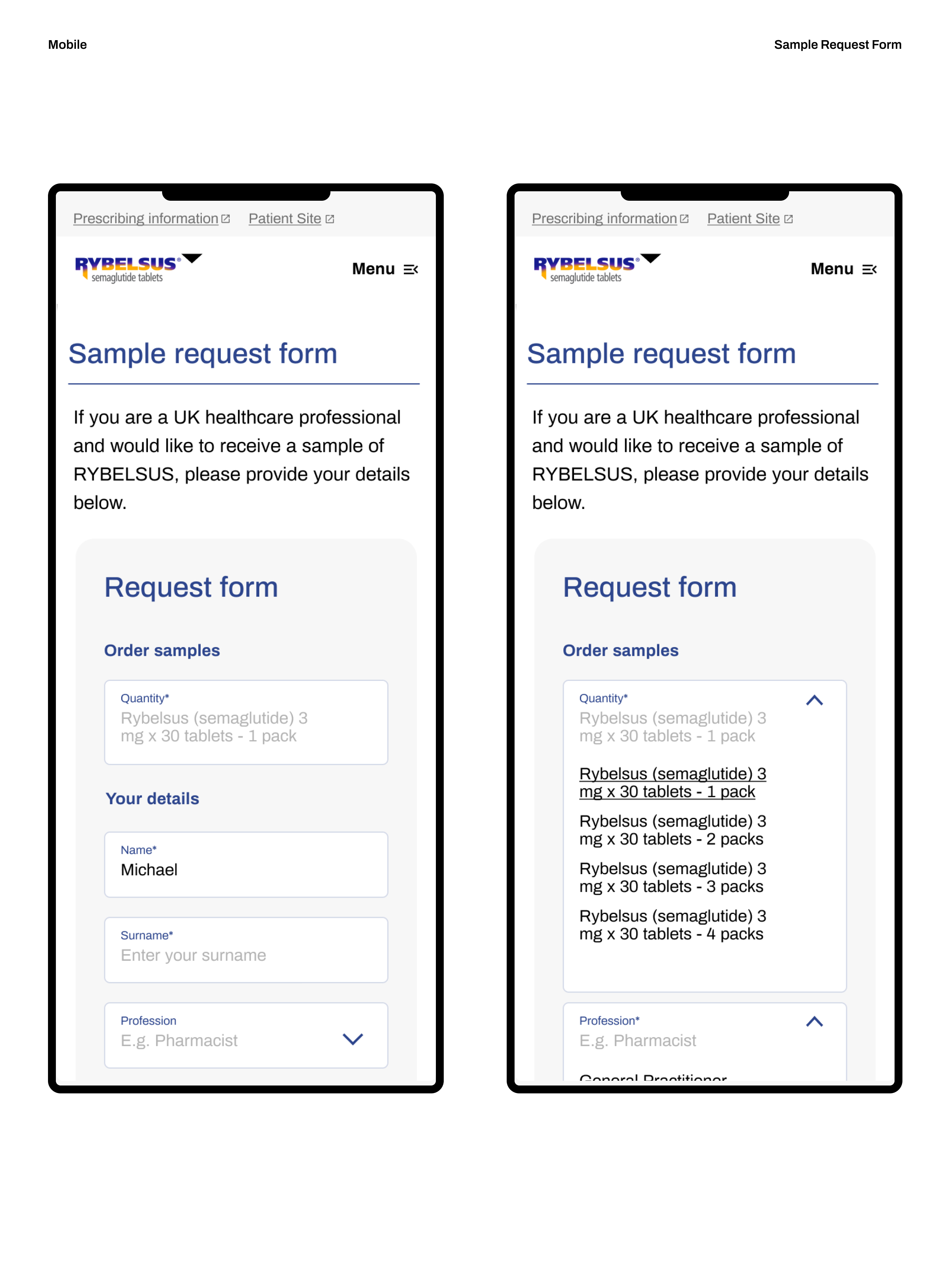
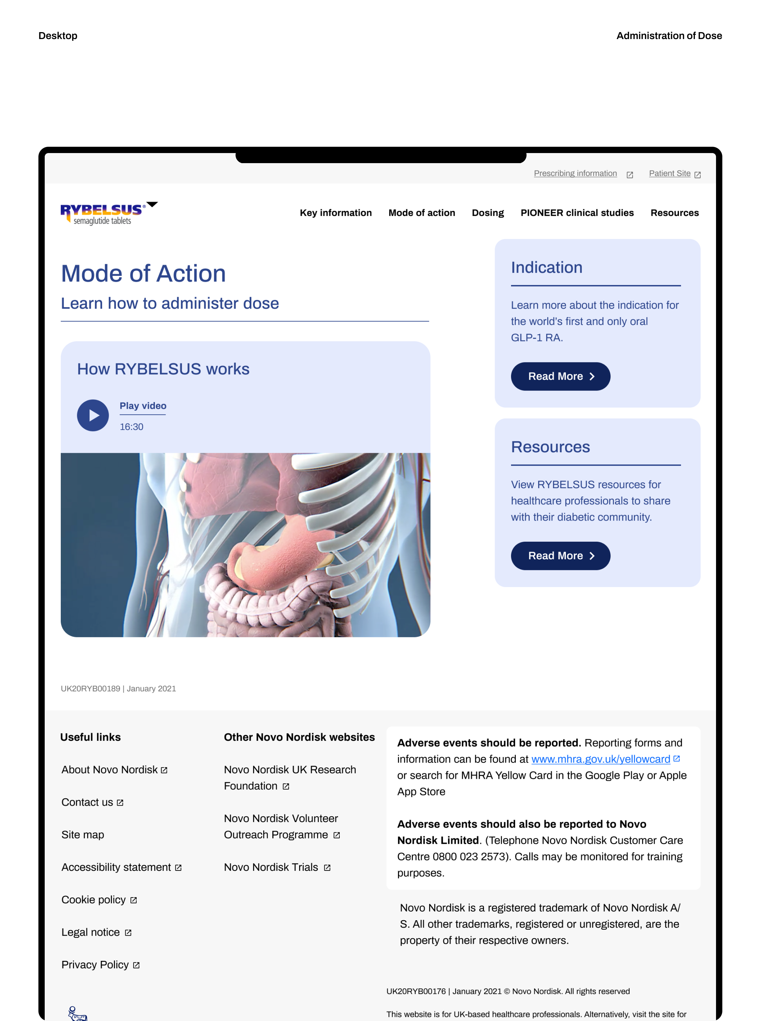
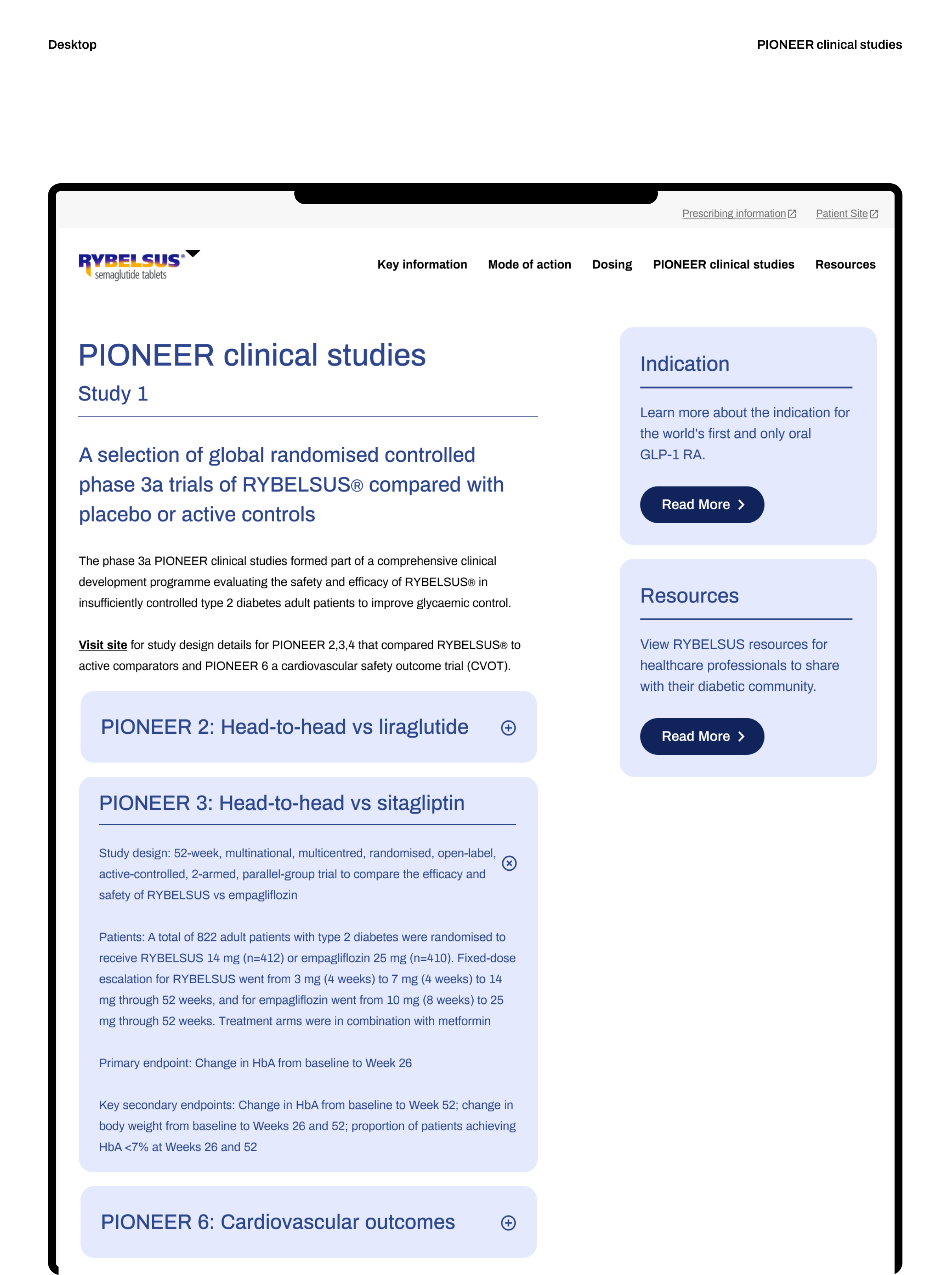
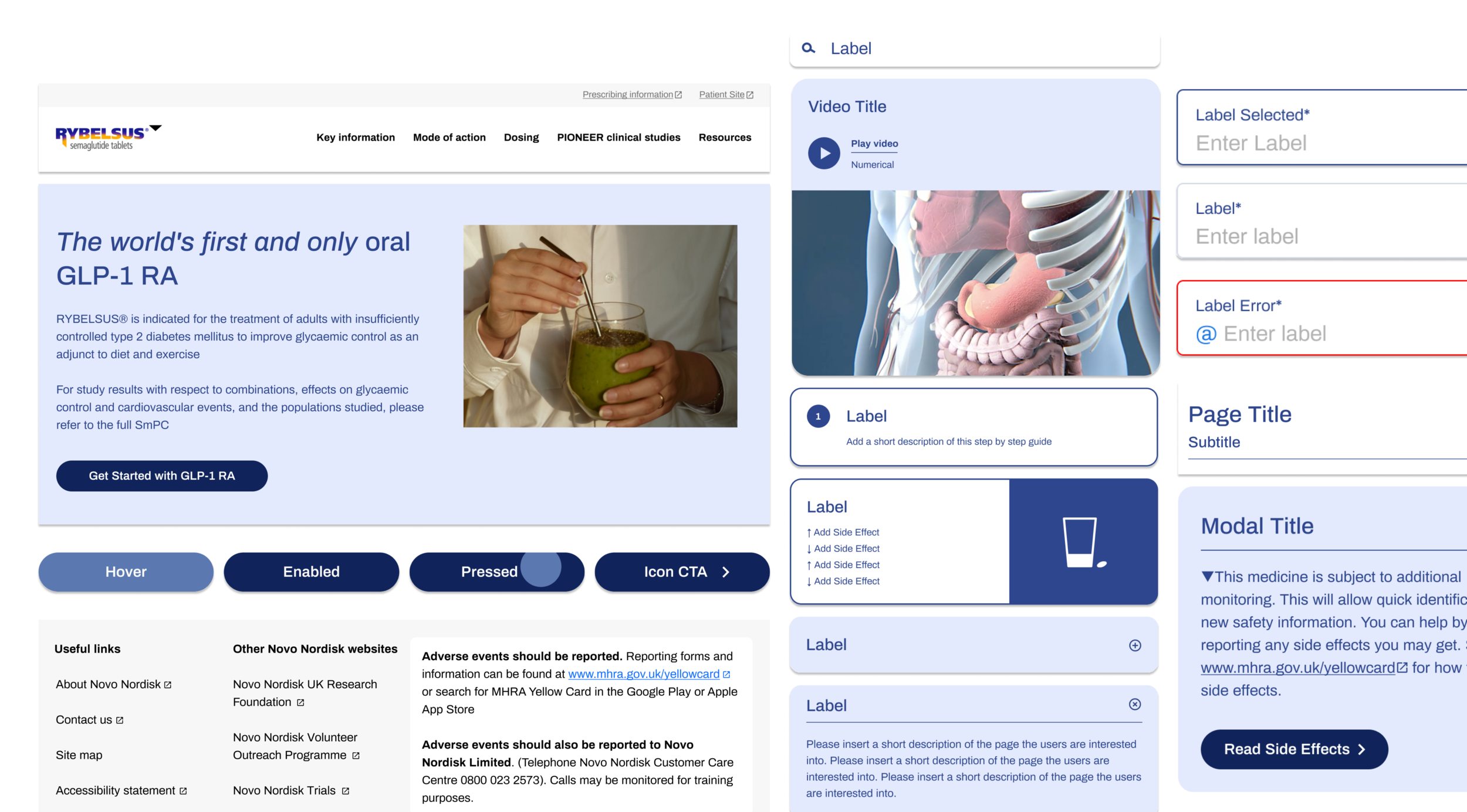
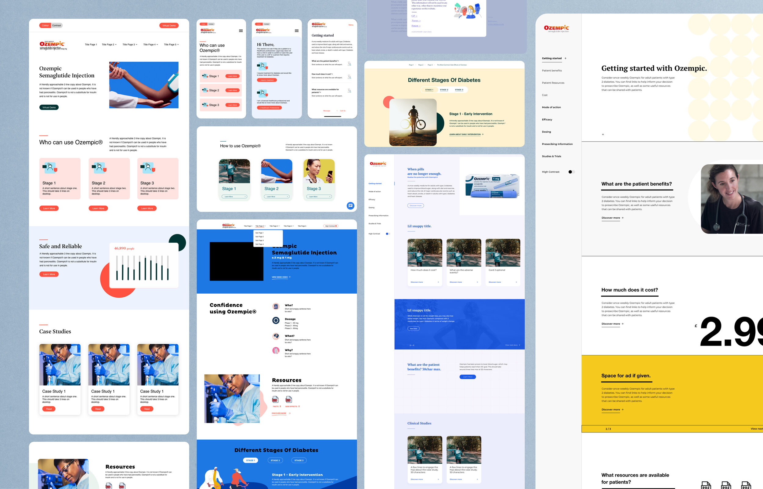
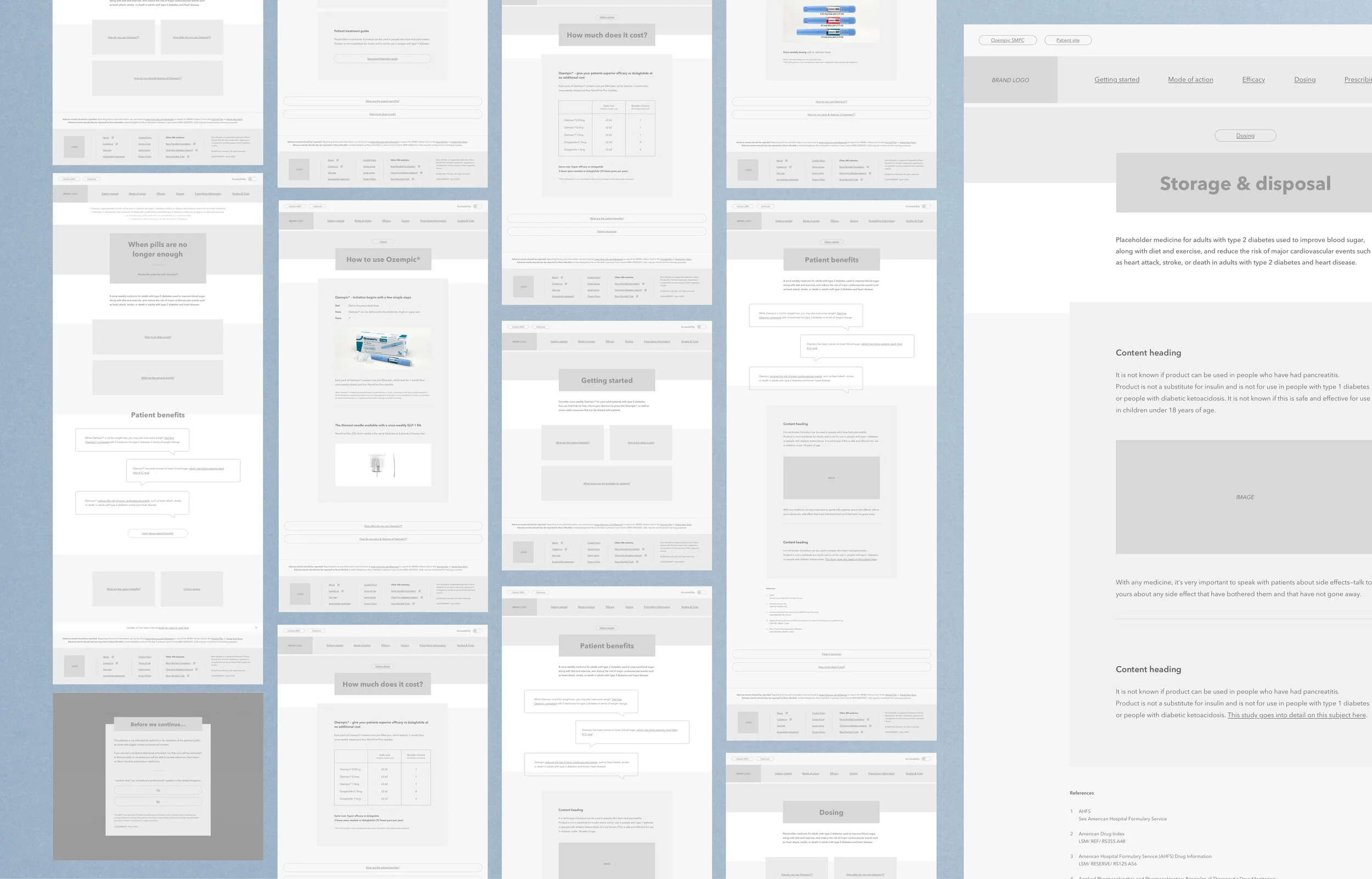
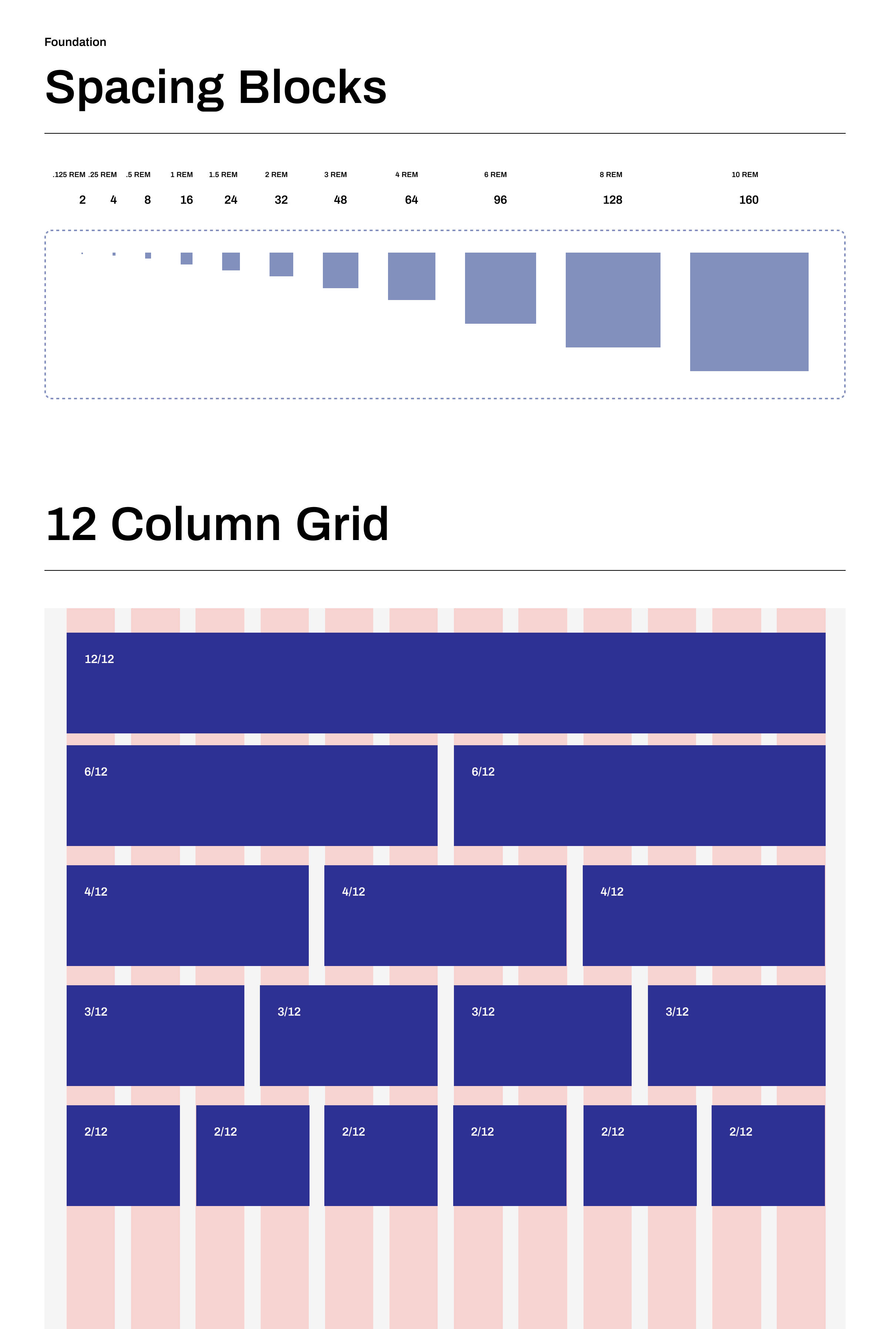
Building a design system of reusable components, guided by design principles, that can be assembled and rebranded across different brands within Novo Nordisk scaled on both mobile and desktop. In this project, you will see some of the components I built for Nord Design System with 50+ interconnected libraries. Complete with documentation to bridge the gap between designers, developers, and internal and external partners.
The Process
Design Sprint
Design sprints helped us understand the needs of our healthcare professionals and diabetic people. Collaboratively with our clients, we identified the core components and visual language.
Reference Designs
I continued by compiling page concepts spanning products and platforms to normalize the visual language and component design decisions. Meanwhile, our UX designer worked on establishing the information architecture of the microsites.
Designing Accessibility
One of our design principles was accessibility. During our research, we discovered that diabetic users can suffer from multiple vision impairments and therefore we made it a priority to have an AA+-compliant design system.
Considering that all existing brand assets were print-based, I had the challenge to translate all brand’s colour palettes from print to digital AA+ compliant with varied palettes to make each brand distinctive.
Stark and WC3 Accessibility were used to measure colour contrast and typography hierarchy.

Prioritise System Components
We conducted a workshop with Novo Nordisk teams including developers and stakeholders to identify what components the team would prioritise for this system. As a result, our goal for V1.0 was to build the foundations by creating a scalable visual language and building atomic components most often reused and combined to make user experiences.

Design, Develop, Document, and Publish
The process to make and maintain a white-label design system required cross-functional collaboration. Using an agile approach, we set up sprints to include design QA to keep consistency across all microsites while identifying and addressing problems quickly.
Documentation is crucial when handing over to developers and external partners as this is a record of basic guidelines, design principles, components, patterns functionalities, and variations to ensure proper inclusion and adoption.

Results
Five brand microsites that Novo Nordisk brand managers can use and adapt for their tone of voice.
A digital platform for General Practitioners to use and share with their patients as an informative resource.
Efficiently producing consistent and accessible future microsites.
Documentation and design principles for Novo brands & digital platforms.