Reviving paused subscribers and boost website engagement
Helping paused customers resume their subscriptions with less friction.

The primary goal of this project was to update and modernise an outdated paused page within Butternut Box's online platform to improve customer engagement and user experience.
About
Role
Product designer within Retention Team
Deliverables
User Research, Prototyping, UX/UI

What our users were seeing before this project kicked off. 👀
Our process started with a couple of weeks of moderated usability testing with existing paused clients to get a well rounded view of how the paused experience can be improved. During this time I ran a workshop with our project manager and engineers to understand any technical constraints, while also getting their perspective on the existing paused experience.
-
Users struggled to identify the action they wanted to take, resume their subscription, order an on-demand box and treats, view their upcoming deliveries and view past orders.
-
The user experience for paused users significantly differed from that of the on-going subscribers. The designs were not up to speed with the remainder of the website.
-
Users struggled to find and identify the price per box of their monthly subscription. This often resulted in a high bounce rate.

✨ Some results from a Moderated User Testing Session

Once the designs have been signed off and meet the product requirements we decided to move on to creating the final designs before handing them over to developers
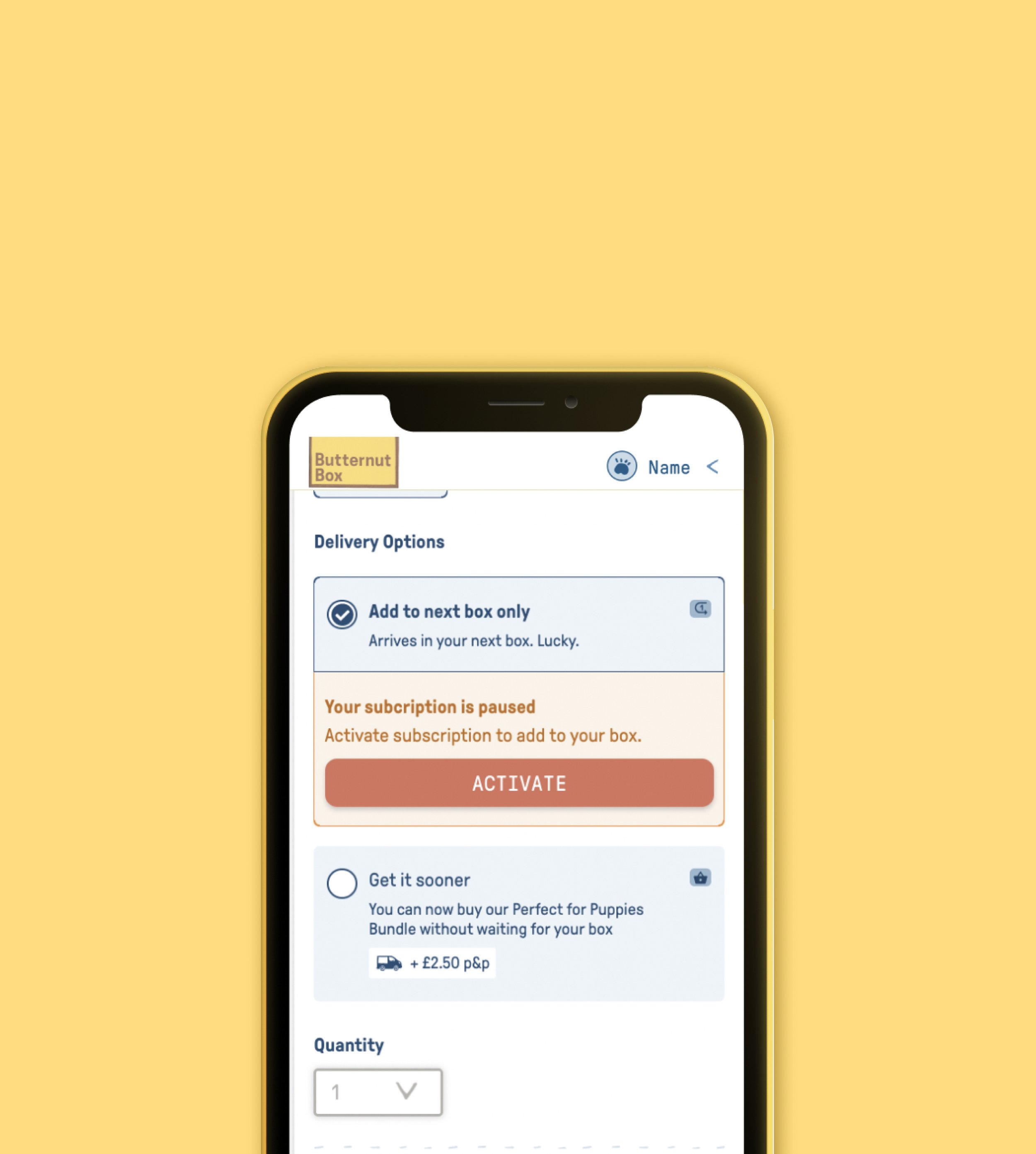
New components were created as our design system lacked designs that could accommodate these styles of cards.
When I design new components it is important to
Defining new components in the design system
-
We were hesitant to introduce new components to our extensive design system. However, the existing one was outdated and cumbersome, prompting us to take the opportunity and create a better alternative
-
With properties and variables established, the components can be effortlessly adapted for various purposes, aiding in maintaining a concise design system.

✨ The winning variant on desktop. It successfully meet business goals and user goals to increase conversion rate
Once the product has been launched to a broad customer base, it was essential for us to track its success through analytics & re-activations. A week after its launch we saw an increase in our reactivations and met our quarterly goal of retaining happy dogs.
What we achieved
-
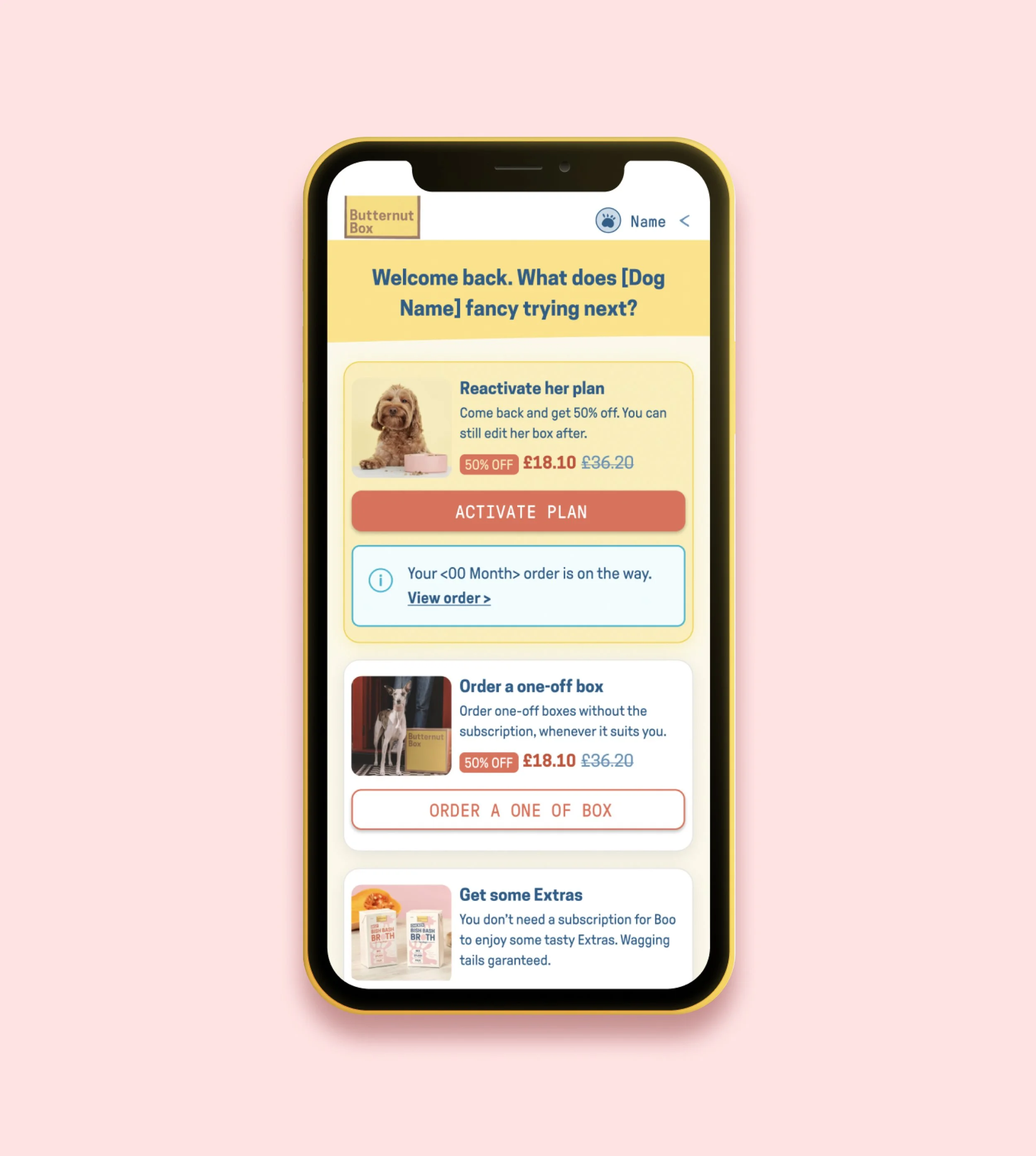
Streamlining the paused landing page by removing unnecessary features enabled users to concentrate on tasks they are more likely to accomplish as paused users. Additionally, strategic colour schemes and positioning emphasised the importance of the 'Resume Account' card.
-
Intentional card design allowed us to convey information succinctly, surfacing high-level actions early on to enhance user confidence during account reactivation.
-
Introducing the 'Order a one-off box' option encourages users who are hesitant to commit to the full subscription, resulting in increased conversion rates and reduced bounce rates.
Like with every projects we were bound to experience a few bumps along the way. Here is what I found challenging and how I approached it.
What could have gone better?
-
The initial designs proposed offered a clearer indication of what users could expect upon resuming, including details like pouch sizes, cadence, and daily calories. However, upon stakeholder review, it was deemed overly complex.
-
The product manager aimed to swiftly launch our initial iteration, prompting us to opt for a more straightforward design through compromise.